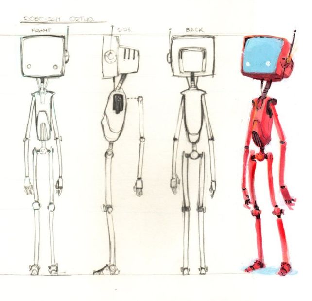
My first Module in Uni is Asset Design and Modelling with our first lesson being on an introduction to Maya.
We were tasked to create a characters head, or if you had time, a body as well, during the lesson and to have it finished by next lesson.
However, we were not allowed to edit sub-components of the model, such as editing vertices or edges and so had to make the entire model from just primitive shapes and then edit it with transform, scale and rotate only.
This is the character I decided to model during our first lesson.
I found it really strange to model with just the primitive shapes without editing the other sections as I have been so used to pulling the shapes around within Nextgen in the past two years.
This is the final model I had created by the end of the lesson. We were also allowed to colour our model, but only using basic colouring methods with Lamberts and Blinns etc.
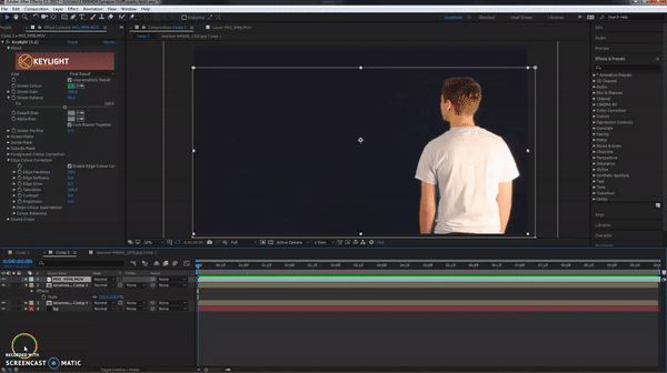
During one of the scenes in act 2, I was given the task to create the logo to go onto the side of the building, “CG Enterprises”.
I made this within photoshop and then exported it into illustrator to create a vector of it.
This then meant I could put it into after effects and create a 3d Object from the logo vector.
Originally I was going to create a 3D model of the logo within Maya, then export it out into after effects to make the track.
However, I used the vector from Illustrator, created outlines from it within After Effects and turned it into a 3D image.
I then added a spot light into AE to allow the shape to project shadows and have a slight glossy look to it.
18/05/17
I had a few problems withe After Effects crashing a lot, due to it not being able to RAM Preview. I found out that I had RayTrace 3D enabled as the chosen renderer, which is why it was taking ages to just preview the scene.
Classic 3D rendered almost instantly, however, I need to use a 3D renderer to be able to see the 3D effects of the logo, so it was a choice of either CINEMA 4D , or RayTrace 3D.
I eventually went with CINEMA 4D, as this rendered things quicker than RayTrace, but still allowed me to use the 3D logo.
22/05/17
I came across a few problems with trying to add effects to the vector, due to it being, a vector.
So I have pre-composed the vector, lighting and null object into a new pre-composition , which has finally allowed me to edit it properly.
I have added a mix of effects onto this, Curves, Hue and Saturation, CC Vector Blur, CC Light Sweep, CC Cross Blur and Drop Shadow.
Tweaked the brightness of the sign to make look more real.
As we will be needing different types of work in our portfolio, I have made a pulsing motion graphic using circles and the repeater on multiple shape layers.
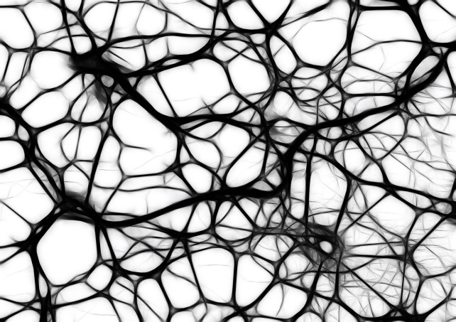
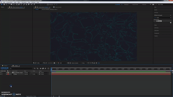
For part of the inside the head scene there will be neurons in the background, so I am making these within After Effects using this image from Google.
First try I used a mix of Glow and Vegas effects to create this.
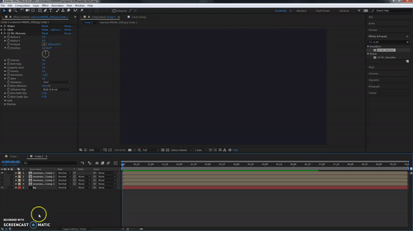
I added more layers of this, starting them at different times and changing each layers colour, however I didnt think this would work that well, so I created a new comp and added a CC Mr Mercury effect and played around with it until I made an effect that worked well.
I duplicated this layer and added another colour and again, changed the timing on it, as well as adding a piece of test footage we took from the green screen room.
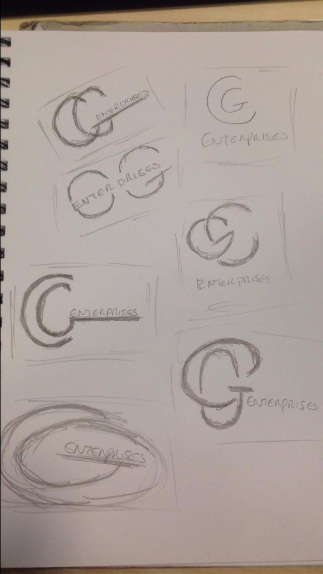
During some shots of the film, we are going to include a logo for the company “CG Enterprises” , so I needed to create some concepts for this, then allow the group to vote on a design they like.
These are some of the designs I quickly mocked up in my sketchbook, I then sent these to the group, coming back with these results.
As there was a majority vote for the top left design, I then made a mock version in photoshop, then sent it to the group again.
The only thing that they said to change was the boldness of the font, ending up with this design.
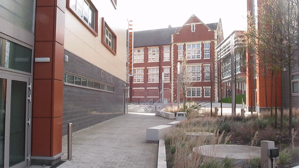
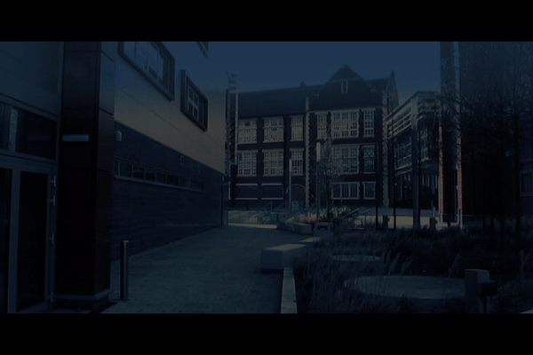
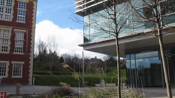
As some scenes in the project are set in the night, we may have to film them during the day and perform Day to Night Correction within after effects, so I took some footage from around the college building and practiced the DTNC on them.
One example of some test footage I took
I decided to leave this piece of footage as while I was doing some colour correction, I realized that there was a lot of sunlight in the shot and it would be best to use some footage that was all in the shade, or all in sunlight as it is easier to convert.
Footage 2
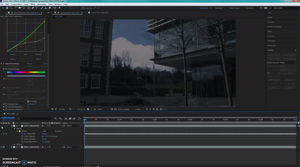
I then tried to correct the other footage, this time tracking a section of the sky as well to change its colour
I did originally try to track within mocha, but for some reason the software crashed every time I launched mocha, so I needed to track it myself with in AE.
With and without mask
Unfortunately, after effects kept crashing again, so I changed to another piece of footage to try out on.
Its been a very long time since I have drawn a car, I used to draw them a lot while I was in primary school, but that was about 10-11 years ago, so I need to practice drawing them more.
When I was little I used to free draw cars the majority of the time, as well as draw cartoony styled cars where they were squished up and with giant wheels.
Other times I would use this little tool kit for drawing curves and circles that I got with a how to draw cars book as a present.
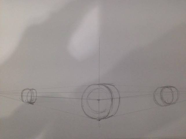
So today I tried to follow a few tutorials on how to draw cars on perspective or without perspective using the wheel trick, where you draw 4 wheels, all the same distance from each other and then draw a box on top of that for the car.
Perspective drawing of car 1
Perspective 2
I wasnt that keen using the perspective way of drawing the cars, but I will try to practice this some more.
This one was using the spacing of the wheels, and then adding the box shape of the car on top, personally I preferred this one over the perspective one.
The Subaru Impreza WRX STI was always one of my favourite cars to draw when I was little, so this is the one I decided to draw during the free hand sketch, this felt a lot more natural and easier to do, but I feel as though the back end of the car is too long, I just need to practice getting the proportions correct.
Enter a caption
This final drawing of a Nissan Skyline GTR R34 was a mix of all three, perspective and wheel spacing, then free drawing over the top